I find joy in those spontaneous bursts of design inspiration. The thrill of diving into the latest industry trends, reaching for pen and paper, and ultimately translating ideas into reality using Figma is a constant catalyst for my growth as a designer. Come see my explorations on my Dribbble page where I share more of my design ideas.
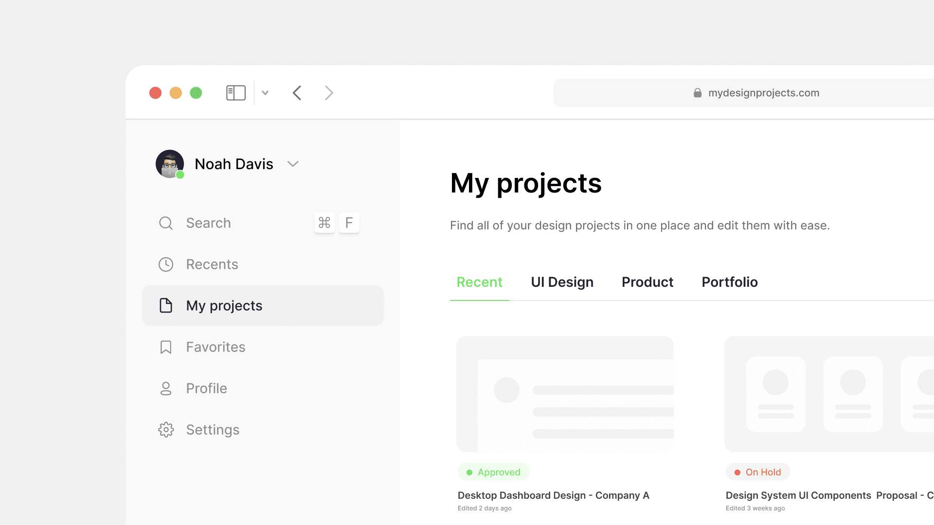
For me, simplicity in my workflow is crucial when managing multiple design files simultaneously. I created a streamlined dashboard for a design software, allowing users to access files effortlessly. My primary focus was on offering a clear overview of project statuses and ensuring intuitive navigation.
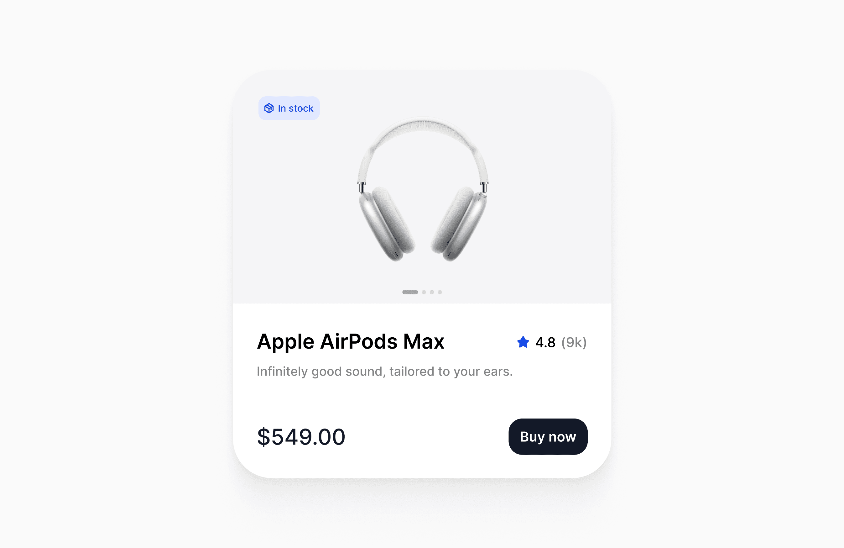
While creating a product card for an E-commerce site, I've opted for a minimalistic design. I've infused interactivity to hone my motion design skills and bring my ideas to life.
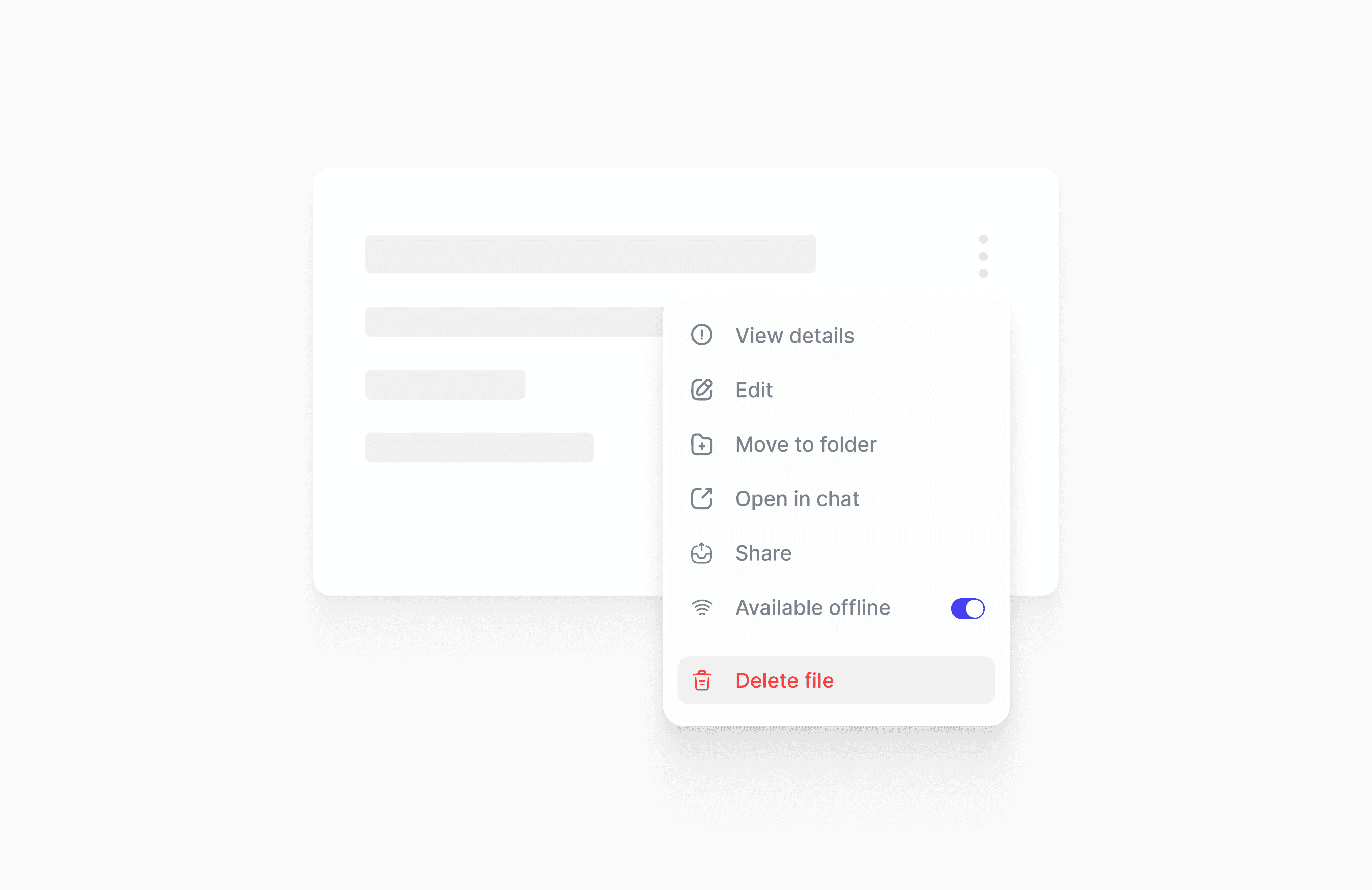
In this minimalist dropdown list design, I focused on the smallest details. I explored iconography, typography, and spacing, recognizing their pivotal role in the overall design aesthetic.
Creating a profile card for a professional networking site involved a continuous cycle of iteration. I honed the interface, retaining only the most crucial functionalities.
Self-learning is a skill in itself. Inspired by my UX design journey, I challenged myself to create a course interface with a clean design for a sophisticated learning experience.
While designing a product card, I used auto layout settings to enhance scalability for future adjustments. This ensures seamless adaptability as the project evolves over time.
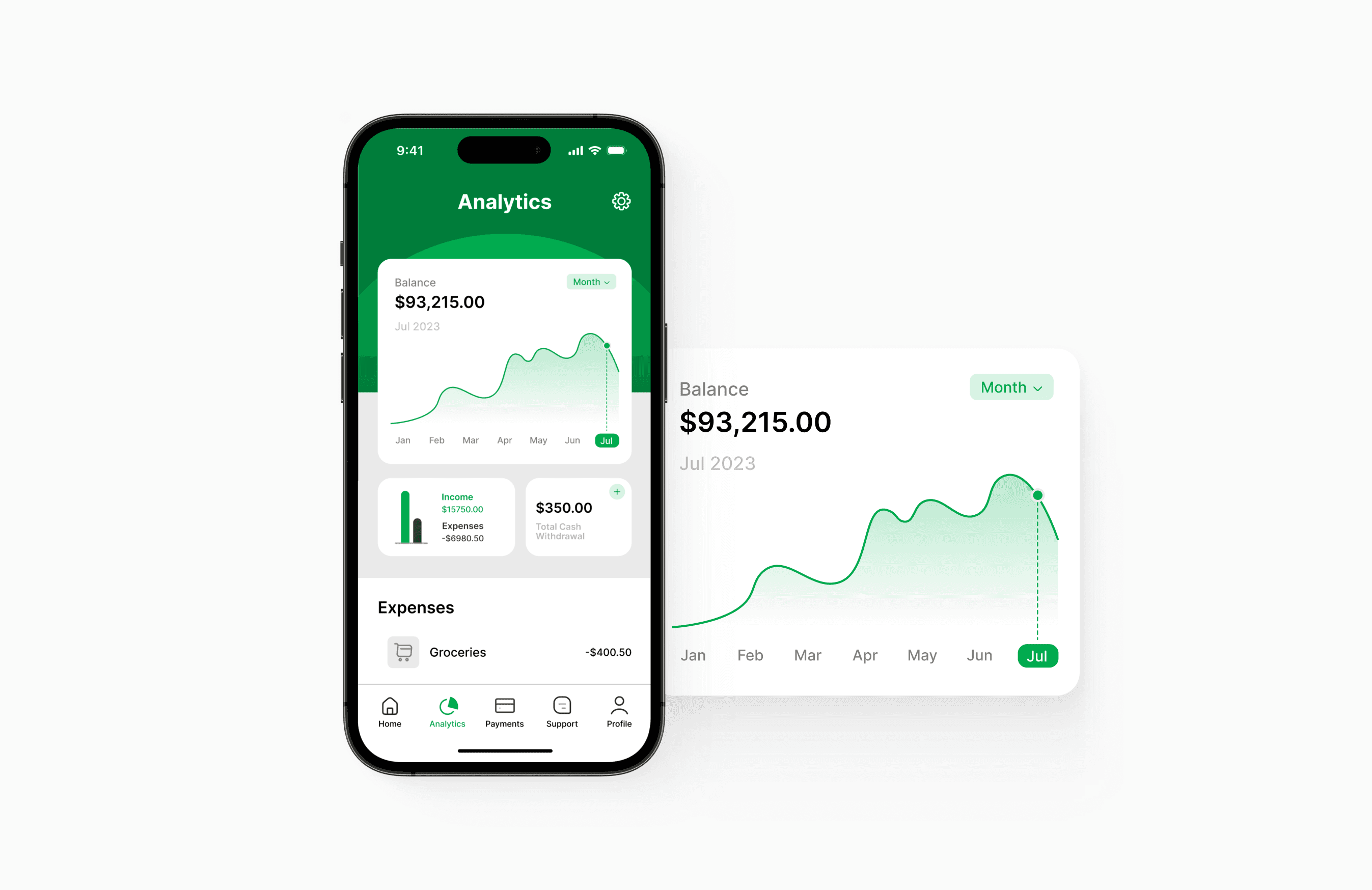
Designed an analytics screen for a personal finance app allowing users to easily manage their cash flow. Chose green to evoke emotions like growth, power, and logic.
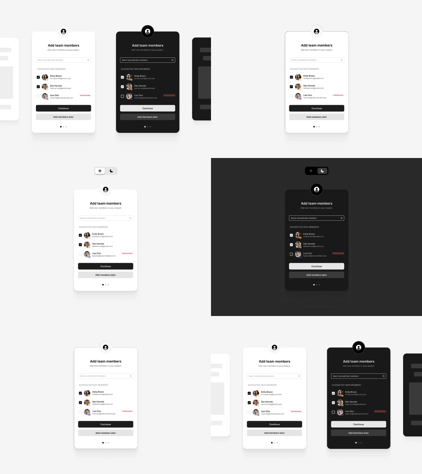
Explored light and dark mode UI for this simple admin modal to select team members. During the design process my focus remained on ensuring usability and simple interactions.
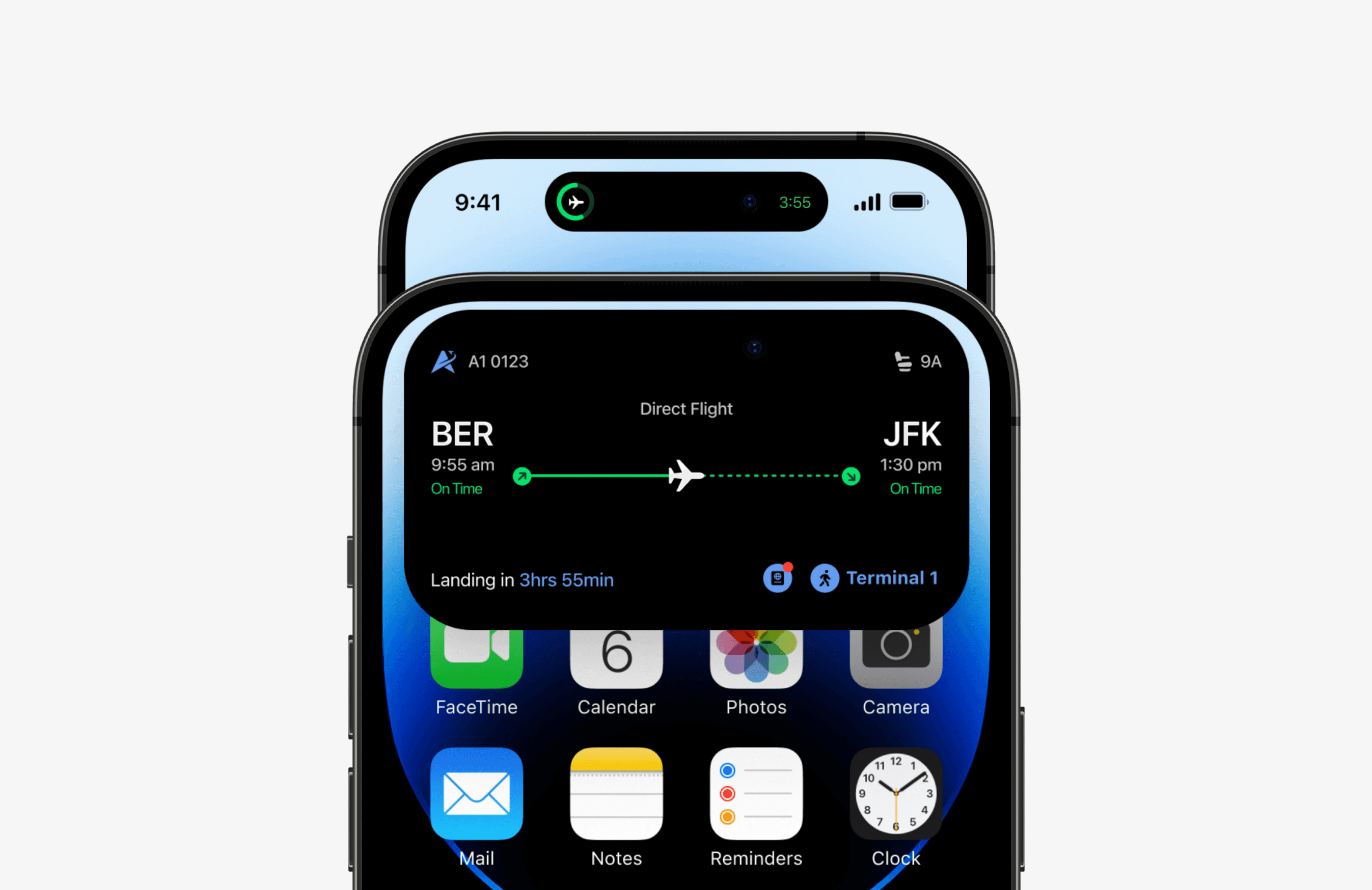
Explored an iPhone Dynamic Island concept for a travel app. I aimed to incorporate all information in my design that might be useful for the users during traveling.
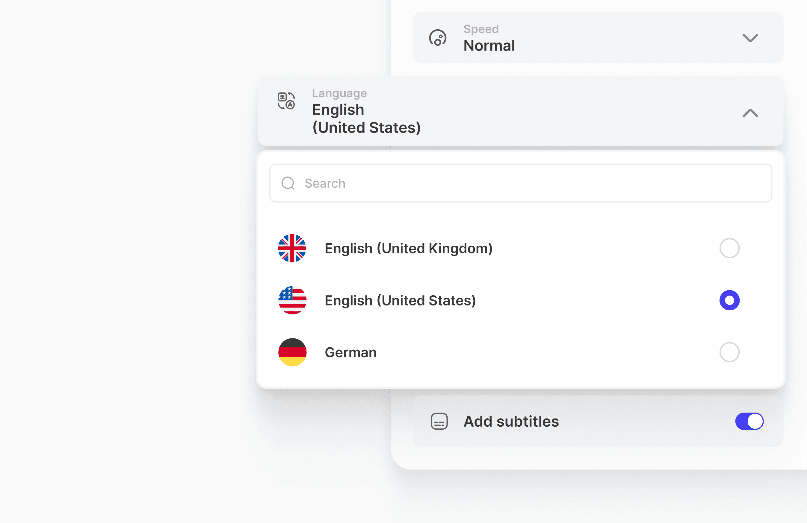
For the design of a Text-to-Speech application, my research showed a user preference for easy editing. I honed the interface to be intuitive for customization.
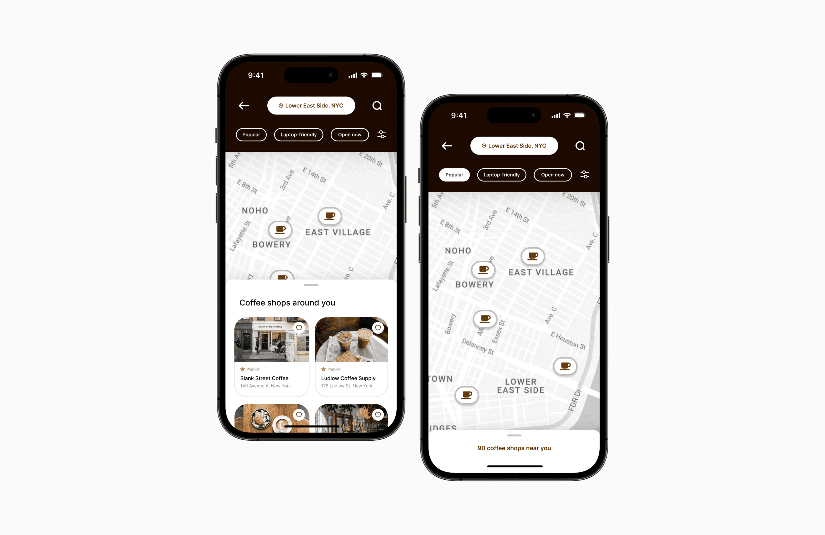
Simplifying your coffee choice. Designed a coffee shop locator mobile app with personalized search filters. Moving forward, I plan to explore features like creating customized saved lists.
For me, simplicity in my workflow is crucial when managing multiple design files simultaneously. I created a streamlined dashboard for a design software, allowing users to access files effortlessly. My primary focus was on offering a clear overview of project statuses and ensuring intuitive navigation.
While creating a product card for an E-commerce site, I've opted for a minimalistic design. I've infused interactivity to hone my motion design skills and bring my ideas to life.
In this minimalist dropdown list design, I focused on the smallest details. I explored iconography, typography, and spacing, recognizing their pivotal role in the overall design aesthetic.
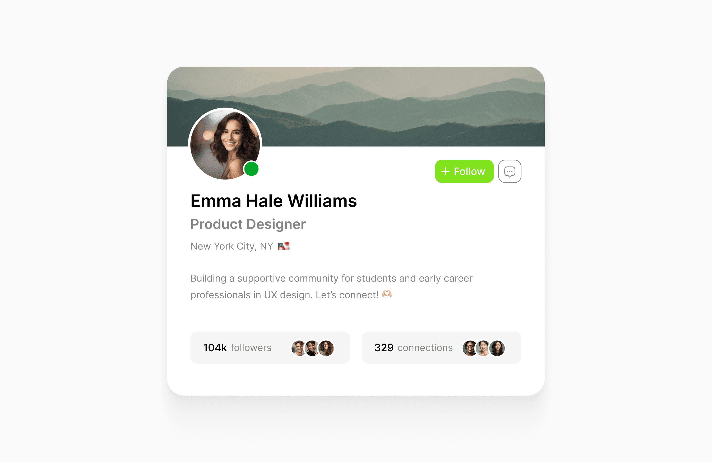
Creating a profile card for a professional networking site involved a continuous cycle of iteration. I honed the interface, retaining only the most crucial functionalities.
Self-learning is a skill in itself. Inspired by my UX design journey, I challenged myself to create a course interface with a clean design for a sophisticated learning experience.
While designing a product card, I used auto layout settings to enhance scalability for future adjustments. This ensures seamless adaptability as the project evolves over time.
Designed an analytics screen for a personal finance app allowing users to easily manage their cash flow. Chose green to evoke emotions like growth, power, and logic.
Explored light and dark mode UI for this simple admin modal to select team members. During the design process my focus remained on ensuring usability and simple interactions.
Explored an iPhone Dynamic Island concept for a travel app. I aimed to incorporate all information in my design that might be useful for the users during traveling.
For the design of a Text-to-Speech application, my research showed a user preference for easy editing. I honed the interface to be intuitive for customization.
Simplifying your coffee choice. Designed a coffee shop locator mobile app with personalized search filters. Moving forward, I plan to explore features like creating customized saved lists.
For me, simplicity in my workflow is crucial when managing multiple design files simultaneously. I created a streamlined dashboard for a design software, allowing users to access files effortlessly. My primary focus was on offering a clear overview of project statuses and ensuring intuitive navigation.
While creating a product card for an E-commerce site, I've opted for a minimalistic design. I've infused interactivity to hone my motion design skills and bring my ideas to life.
In this minimalist dropdown list design, I focused on the smallest details. I explored iconography, typography, and spacing, recognizing their pivotal role in the overall design aesthetic.
Creating a profile card for a professional networking site involved a continuous cycle of iteration. I honed the interface, retaining only the most crucial functionalities.
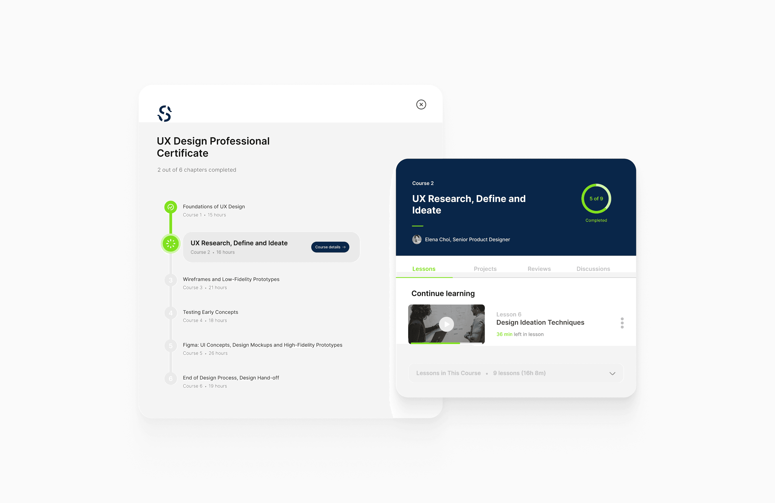
Self-learning is a skill in itself. Inspired by my UX design journey, I challenged myself to create a course interface with a clean design for a sophisticated learning experience.
While designing a product card, I used auto layout settings to enhance scalability for future adjustments. This ensures seamless adaptability as the project evolves over time.
Designed an analytics screen for a personal finance app allowing users to easily manage their cash flow. Chose green to evoke emotions like growth, power, and logic.
Explored light and dark mode UI for this simple admin modal to select team members. During the design process my focus remained on ensuring usability and simple interactions.
Explored an iPhone Dynamic Island concept for a travel app. I aimed to incorporate all information in my design that might be useful for the users during traveling.
For the design of a Text-to-Speech application, my research showed a user preference for easy editing. I honed the interface to be intuitive for customization.
Simplifying your coffee choice. Designed a coffee shop locator mobile app with personalized search filters. Moving forward, I plan to explore features like creating customized saved lists.